Learn more about contrasts in our conversion-centered design blog post.
Types of calls-to-action
Generally speaking, every email you send should have a primary goal. But what about when you have more than one CTA?
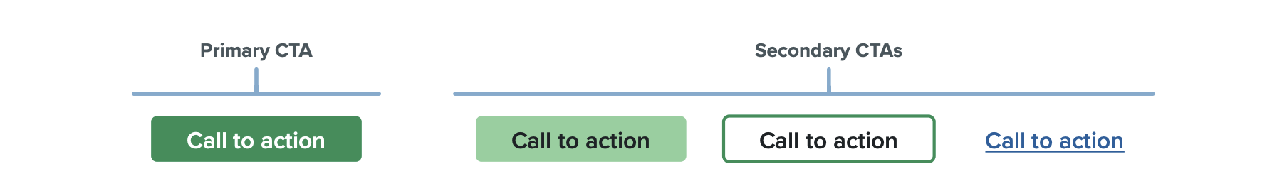
Primary CTAs
Your primary CTA is the main action you want your subscriber to take. It should be the most prominent in your email and styled in a way to help it stand out.
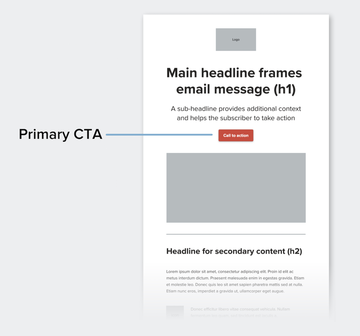
One of the key ways to help your primary CTA stand out is by applying whitespace: space that is uninterrupted by other elements.
In addition to whitespace, you can help your primary CTA stand out by:
- Styling your primary CTA as a button
- Making your button a different color than the other design elements
- Using typography, such as larger or bold text
You want your primary CTA to be seen quickly, too. Placing your most important CTA early in the email is a good way to ensure this. While some might argue that the fold doesn’t exist on mobile, keeping your primary CTA towards the top of your campaign accounts for readers that are not likely to scroll.
Secondary CTAs
After primary CTAs, any additional actions you want your subscriber to take are secondary CTAs. These should be styled in a less dominant way.
By styling your primary and secondary CTAs differently, it prevents them from competing with each other. To achieve this, you can still offer a button, but opt for a muted style—such as a color that isn’t as bold or a white button with a color border, shown below.
Here are some examples:
You can also simply offer a styled text link, which we’ll cover in the next section.
Styling CTAs
There are several ways you can style your CTAs to help them stand out in your designs. The following are a few methods that can be applied to help subscribers more clearly identify your CTAs, whether they’re primary or secondary CTAs.
Styled text links
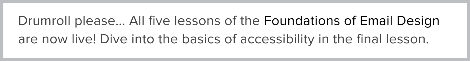
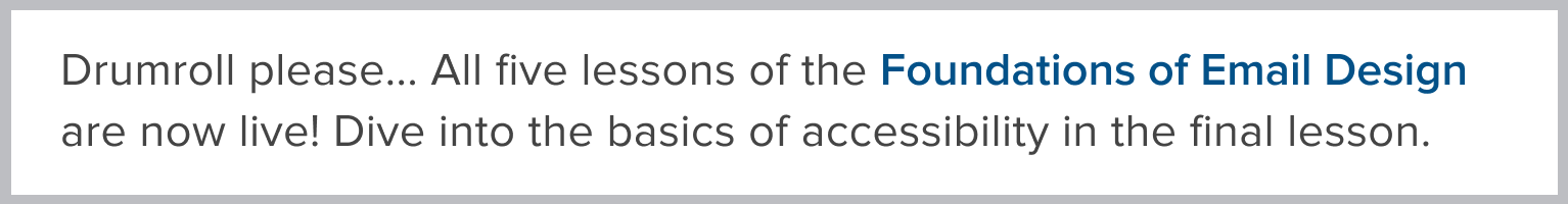
Designers typically don’t have the same level of control over text links as they do with images and buttons. Design techniques—such as adjusting the size of a link within a block of copy or increasing the space surrounding text links—aren’t as effective and can sacrifice the design of the email. Therefore, color and font weight are the most important tools when dealing with text links.
For a styled text link to be effective, you should consider two things: 1) the text should be a different color from the primary copy and 2) it should be underlined. This will help subscribers recognize it as a clickable element to help them take action.
Compare the two blocks of copy below—by stylizing with a bolded font weight and color, the “Foundations of Email Design” styled text link stands out more as a clickable element.
To help your link stand out more, another approach is to add a rollover effect, which we’ll cover next.
Rollover effect
A rollover effect is a visual effect that helps highlight when an element is clickable. These can be applied to text links, buttons, and imagery.
For text links, rollover effects that can be used are a color change or stylizing of text. In the example below, the underline disappears on rollover.

For buttons, the colors change on rollover. In this example from our newsletter, you can see that a more muted color combination is applied as the rollover effect.
Want to see more rollover effects in action? Check out our newsletter in action and hover around the buttons, links, and imagery.
Bulletproof buttons
Bulletproof buttons are CTA buttons built with code instead of images. By only using code, the button will display in all email clients even when images are turned off, which is what makes them “bulletproof.”
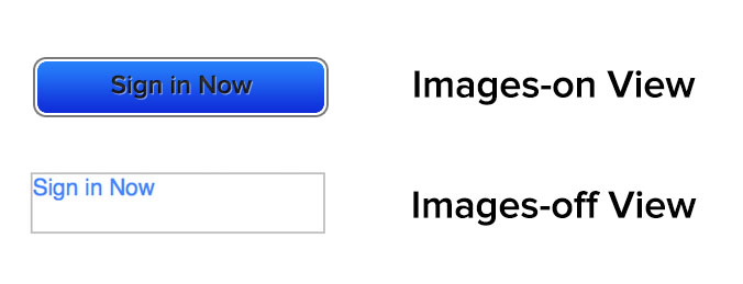
Bulletproof buttons consist of live text styled to look like image-based buttons. They’re the best way for designers to use button CTAs in their emails. Not everyone is able to (or willing to) dive into VML code, though. That’s why we created our step-by-step guide to bulletproof buttons in email for everything you need to know—code included.
How many CTAs are too many?
A strong point of contention between designers is just how many calls-to-action should be included in an email. Retailers generally include dozens of CTAs, the theory being that at least one of them will be of interest to a subscriber. However, many marketers like to focus on one or two CTAs in an attempt to make them more significant for subscribers.
Of the below call-to-action email examples, which strategy works best?


